Let’s talk color, let’s talk design, let’s talk inspiration.
Recently, we have noticed that the color chartreuse has made some surprising appearances into the interior design world. The reason this is so surprising is because it tends to be a difficult color to decorate with! I mean, let’s be real. Its bright green. Buuut of course, we didn’t want to be left out of the fun. That means… (drum roll please…) A CHARTREUSE FORECAST! Yay!
Our goal was to capture the beauty of this color in a way that didn’t overpower the room. So we sat down and made ourselves a mood board.
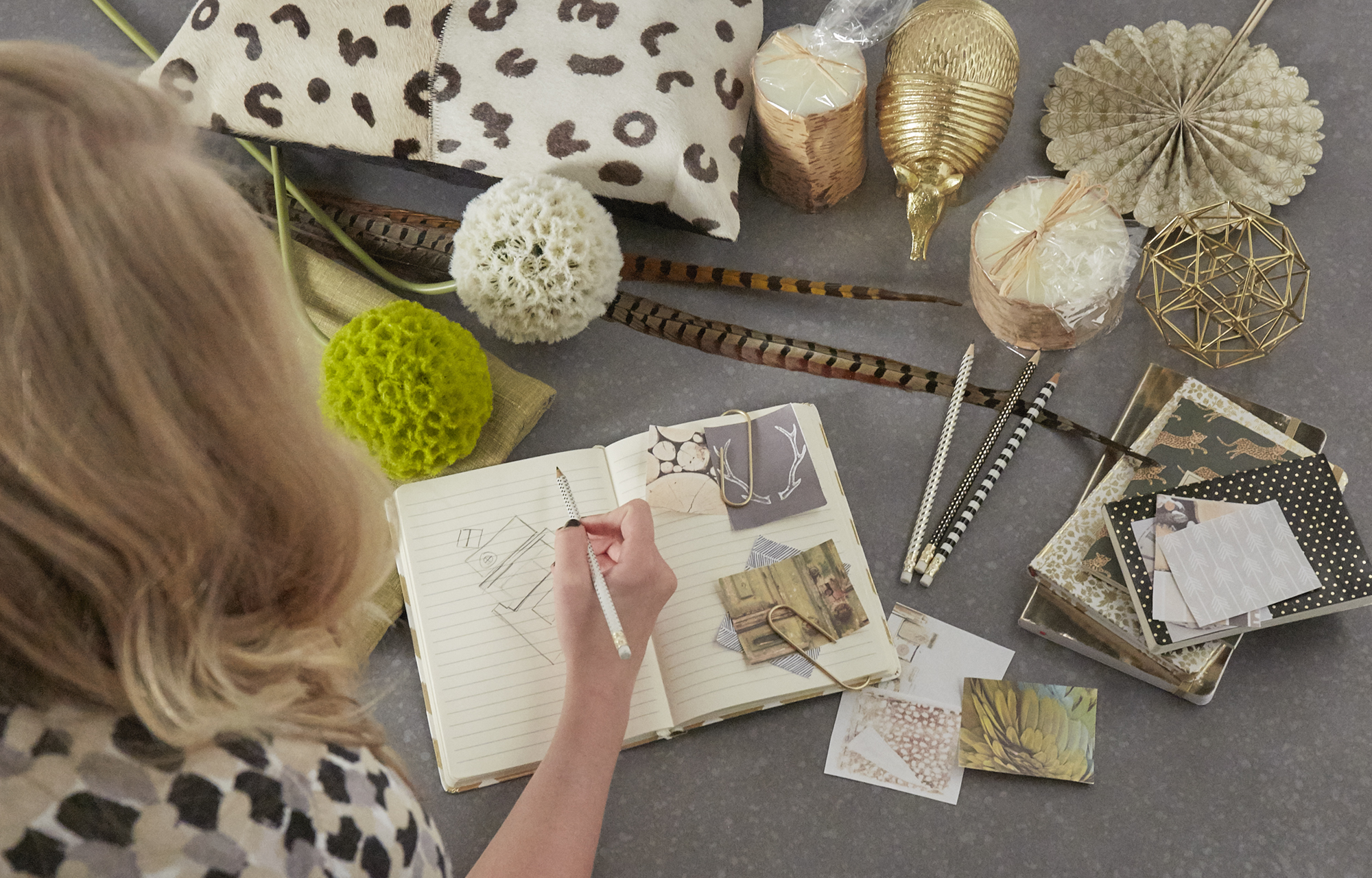
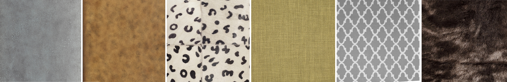
The first question we asked ourselves was: “What colors actually look good with chartreuse?” After playing around a bit we agreed the following color pallet. So of course we had to gather up some of our favorite items from around the studio (including Armando the Armadillo- the studio pet) and get started.
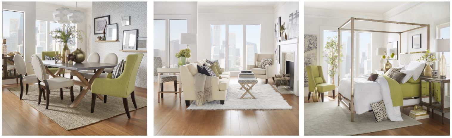
Challenge number one: A beautiful bedroom
For the bedroom we decided that the best way to keep the color from overpowering the rest of the room was to keep the bed sheets chartreuse and the comforter white. This created a colorful little surprise every time the sheets peeked out.
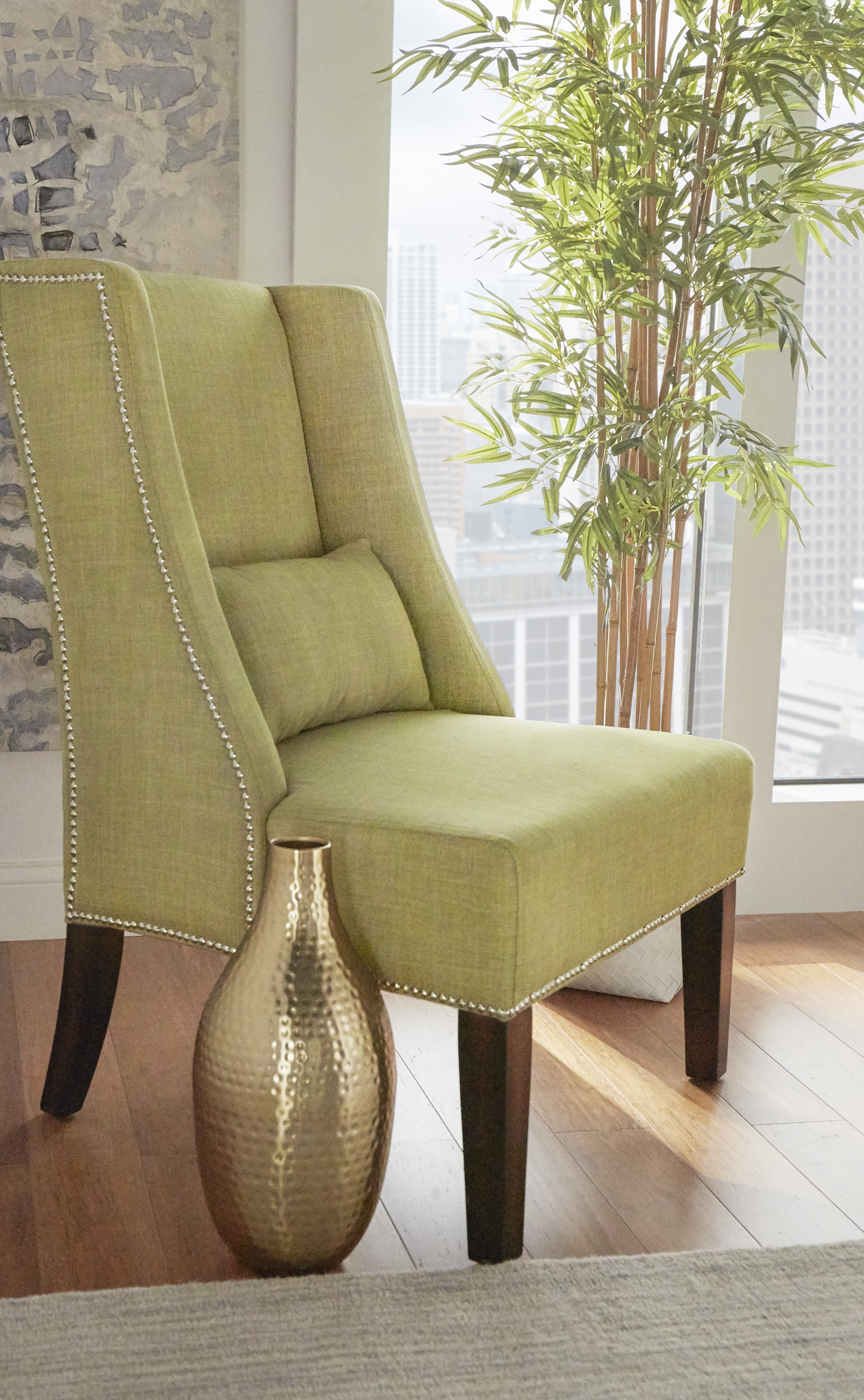
We also decided that a gold framed bed would be a perfect way for us to keep to our color pallet. With this and a few other gold accessories, we were in business!
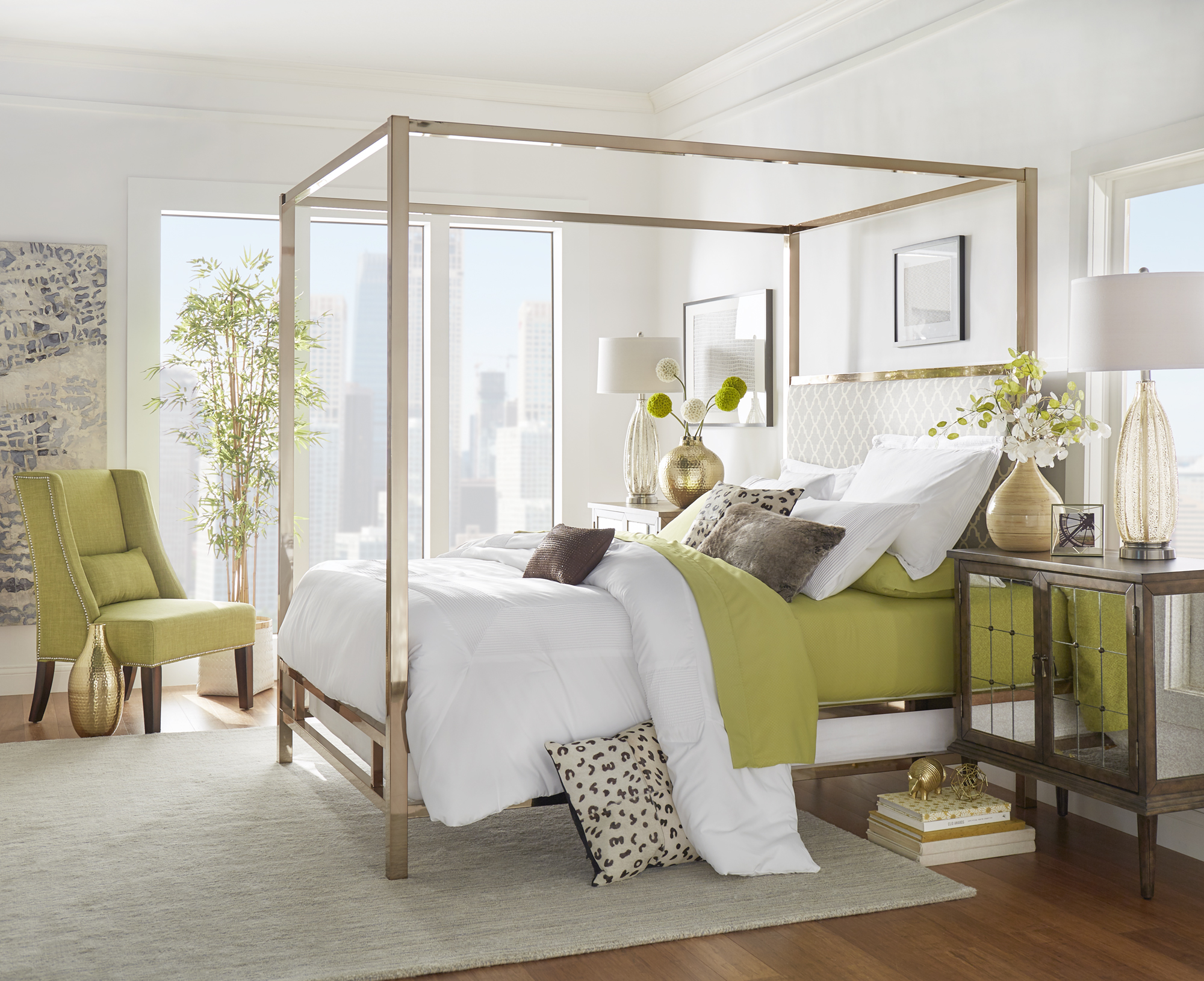
We were able to pull together the rest of the room by adding in the chair and a few flowers. Finally, we just popped on a few animal print pillows and whala! A chartreuse bedroom.

Challenge number two: a desirable dining room
In the dining room we wanted to keep the color very subtle. With this in mind, we simply placed two chartreuse chairs at either end of the table. Add in your animal print wall and some wooden finishes and there you go! Just make sure the other chairs you use are a neutral color. We want the chartreuse chairs to be the main attraction.
![E532C-GF(3A) + 5100-84(MTL)[TBL] + E546C-YL(3A) + leopard wall _LS1IQSM10](https://blog.inspireq.com/wp-content/uploads/2015/10/E532C-GF3A-5100-84MTLTBL-E546C-YL3A-leopard-wall-_LS1IQSM10.jpg)
Challenge number three: a lovely living room
Luckily, we already had some really nice white furniture just waiting for us to dress up! This made the living room super easy.
![E502S-WL[SOFA] + E204C-BL(3A) + 5100-04(3A) + E355BS-morrocan print GREY _LS1IQSM10 (1)](https://blog.inspireq.com/wp-content/uploads/2015/10/E502S-WLSOFA-E204C-BL3A-5100-043A-E355BS-morrocan-print-GREY-_LS1IQSM10-1.jpg)
All we had to do was pop some chartreuse pillows on the couch and some flowers on the table and we were good to go! We ended up with this clean and fresh look.
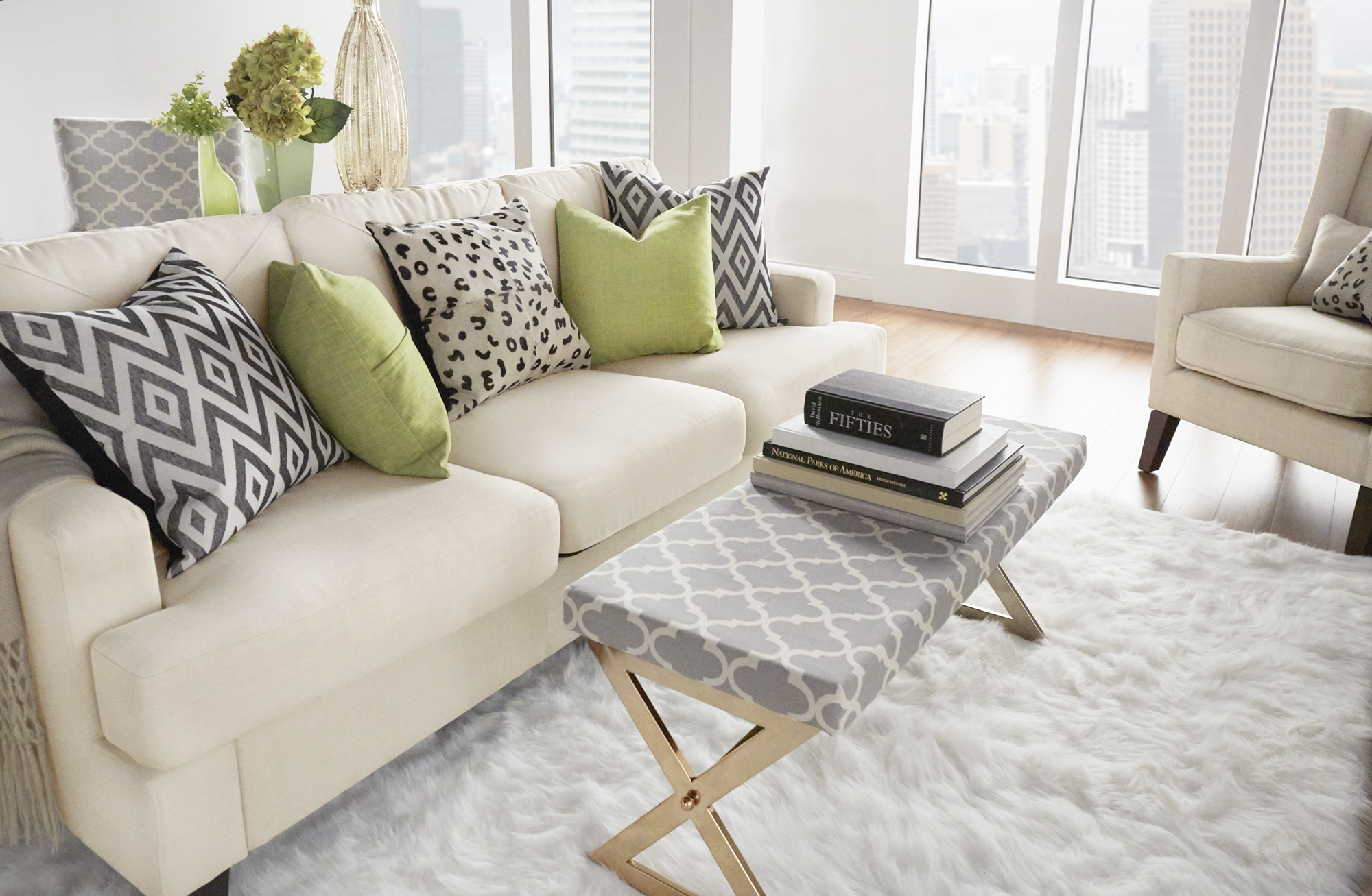
Pro Tip: Don’t be afraid to mix and match patterns. Although we decided on only two prints- we got a little crazy and stuck other patterns in the room as well!
When you know how to use the color, chartreuse is super fun! Its bright, eye catching, and matches perfectly with our gold armadillo.
We hope you are now thoroughly convinced to start using chartreuse in your everyday life and we challenge you to give it a try!